2025
Rightway
RightWay — Building a Brand That Guides With Clarity and Care
Brand Identity
Website
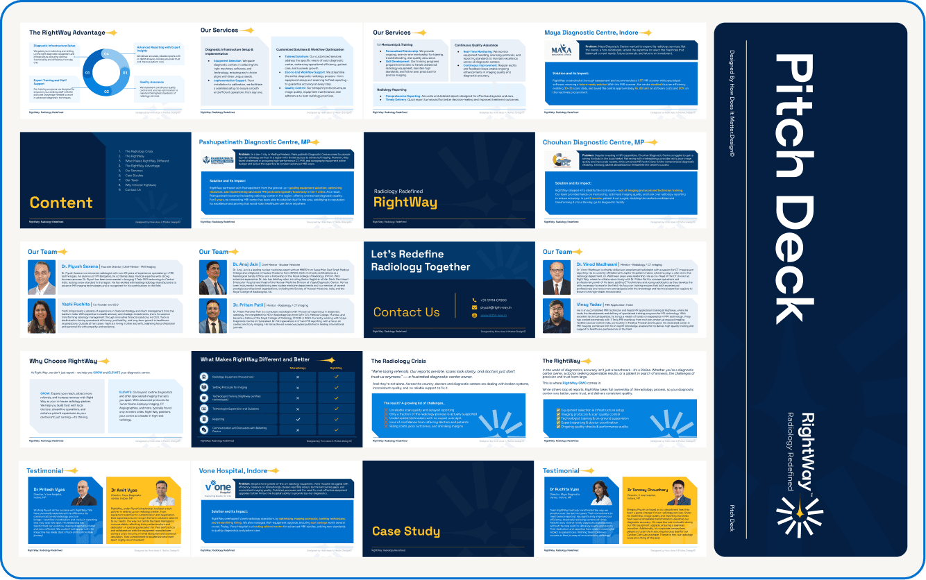
Pitch Deck
Project Lead
Aditya Kumar Sah
Team Member
Aparajita Khandelwal | Sushant Ajnikar
Know More
Branding and identity design for a radiology consulting firm improving diagnostic standards across India’s Tier 2 and Tier 3 cities.
About the Client
RightWay is a radiology consulting firm founded by Dr. Piyush Saxena, a practising radiologist on a mission to improve diagnostic care in smaller Indian cities — places where specialised radiologists are scarce and scan quality often falls short.
The company works as a partner and mentor for diagnostic centres — providing expert reporting, equipment guidance, staff training, and operational structure.
In a field where precision can be life-changing, RightWay brings consistency, accountability, and trust to a system that often lacks all three.
The Challenge
When Dr. Piyush approached us, the company was still known as KRAD. After two years of remarkable work, it had built a strong reputation on the ground — but no brand presence to support it.
There was no logo, no website, and no defined voice.
Each conversation began from zero, relying entirely on personal introductions.
The challenge was clear:
To build a cohesive identity that communicates reliability, professionalism, and purpose — while remaining approachable to both diagnostic centre owners and clinicians.
“We needed a brand that could inspire trust the same way their work already did — quietly, confidently, and with integrity.”
The Process
Our first step was to understand Dr. Piyush’s story — his motivation, his frustrations with the system, and his long-term vision for raising diagnostic standards across India.
Through these conversations, a single idea emerged: guidance.
RightWay wasn’t just a service; it was a path forward — for patients, doctors, and diagnostic centres alike.
That insight inspired the new name: RightWay — simple, honest, directional.
It conveys movement toward improvement, with a human touch.
Design Direction
The logo draws from the North Star and the rising sun, both symbols of guidance, clarity, and new beginnings.
The central needle represents precision.
The rays reflect direction and mentorship.
The circular form signifies completeness and trust.
The Deliverables
Delivering a cohesive brand system that inspires trust and communicates with confidence.
Naming
We rebranded KRAD to RightWay, a name that’s clear, memorable, and deeply aligned with healthcare integrity.
Visual & Verbal Identity
A clean, modern logo and color system inspired by light and clarity.
The tone of voice was shaped to be calm, direct, and jargon-free, speaking to both doctors and partners with confidence and warmth.
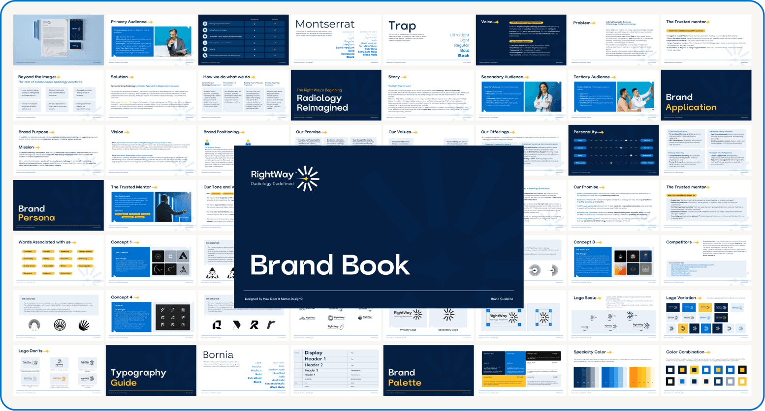
Brand Book
We built a concise brand manual detailing mission, values, logo usage, tone, and color systems, ensuring every future touchpoint stays consistent.
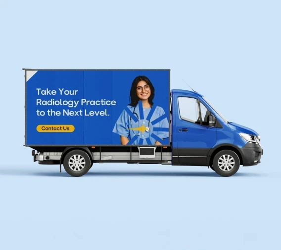
Marketing Collateral
We designed flyers optimised for WhatsApp sharing, helping the team communicate their services directly to diagnostic centres — quick, clear, and credible.
Website
We launched a simple, informative site that introduces RightWay’s work and builds instant trust with potential collaborators and investors.
The Outcome
RightWay now has more than just a new name — it has a clear identity that mirrors its integrity and expertise.
With the brand, website, and communication tools in place, Dr. Piyush and his team can focus on what matters most: outreach and impact.
Instead of having to explain everything from scratch, they can now share materials that speak for them — consistently, confidently, and clearly.
The brand book acts as a compass, helping every new team member understand the company’s tone, purpose, and direction from day one.
Reflection
RightWay reminded me that design, at its best, isn’t about noise — it’s about guidance.
We weren’t creating a brand for visibility; we were creating one for trust.
By aligning visuals, language, and purpose, we helped a small but mighty team find its voice — and set a higher standard for diagnostic care in places that need it most.

More Works
©2024
2025
Rightway
RightWay — Building a Brand That Guides With Clarity and Care
Brand Identity
Website
Pitch Deck
Project Lead
Aditya Kumar Sah
Team Member
Aparajita Khandelwal | Sushant Ajnikar
Know More
Branding and identity design for a radiology consulting firm improving diagnostic standards across India’s Tier 2 and Tier 3 cities.
About the Client
RightWay is a radiology consulting firm founded by Dr. Piyush Saxena, a practising radiologist on a mission to improve diagnostic care in smaller Indian cities — places where specialised radiologists are scarce and scan quality often falls short.
The company works as a partner and mentor for diagnostic centres — providing expert reporting, equipment guidance, staff training, and operational structure.
In a field where precision can be life-changing, RightWay brings consistency, accountability, and trust to a system that often lacks all three.
The Challenge
When Dr. Piyush approached us, the company was still known as KRAD. After two years of remarkable work, it had built a strong reputation on the ground — but no brand presence to support it.
There was no logo, no website, and no defined voice.
Each conversation began from zero, relying entirely on personal introductions.
The challenge was clear:
To build a cohesive identity that communicates reliability, professionalism, and purpose — while remaining approachable to both diagnostic centre owners and clinicians.
“We needed a brand that could inspire trust the same way their work already did — quietly, confidently, and with integrity.”
The Process
Our first step was to understand Dr. Piyush’s story — his motivation, his frustrations with the system, and his long-term vision for raising diagnostic standards across India.
Through these conversations, a single idea emerged: guidance.
RightWay wasn’t just a service; it was a path forward — for patients, doctors, and diagnostic centres alike.
That insight inspired the new name: RightWay — simple, honest, directional.
It conveys movement toward improvement, with a human touch.
Design Direction
The logo draws from the North Star and the rising sun, both symbols of guidance, clarity, and new beginnings.
The central needle represents precision.
The rays reflect direction and mentorship.
The circular form signifies completeness and trust.
The Deliverables
Delivering a cohesive brand system that inspires trust and communicates with confidence.
Naming
We rebranded KRAD to RightWay, a name that’s clear, memorable, and deeply aligned with healthcare integrity.
Visual & Verbal Identity
A clean, modern logo and color system inspired by light and clarity.
The tone of voice was shaped to be calm, direct, and jargon-free, speaking to both doctors and partners with confidence and warmth.
Brand Book
We built a concise brand manual detailing mission, values, logo usage, tone, and color systems, ensuring every future touchpoint stays consistent.
Marketing Collateral
We designed flyers optimised for WhatsApp sharing, helping the team communicate their services directly to diagnostic centres — quick, clear, and credible.
Website
We launched a simple, informative site that introduces RightWay’s work and builds instant trust with potential collaborators and investors.
The Outcome
RightWay now has more than just a new name — it has a clear identity that mirrors its integrity and expertise.
With the brand, website, and communication tools in place, Dr. Piyush and his team can focus on what matters most: outreach and impact.
Instead of having to explain everything from scratch, they can now share materials that speak for them — consistently, confidently, and clearly.
The brand book acts as a compass, helping every new team member understand the company’s tone, purpose, and direction from day one.
Reflection
RightWay reminded me that design, at its best, isn’t about noise — it’s about guidance.
We weren’t creating a brand for visibility; we were creating one for trust.
By aligning visuals, language, and purpose, we helped a small but mighty team find its voice — and set a higher standard for diagnostic care in places that need it most.
More Works
©2024
2025
Rightway
RightWay — Building a Brand That Guides With Clarity and Care
Brand Identity
Website
Pitch Deck
Project Lead
Aditya Kumar Sah
Team Member
Aparajita Khandelwal | Sushant Ajnikar
Know More
Branding and identity design for a radiology consulting firm improving diagnostic standards across India’s Tier 2 and Tier 3 cities.
About the Client
RightWay is a radiology consulting firm founded by Dr. Piyush Saxena, a practising radiologist on a mission to improve diagnostic care in smaller Indian cities — places where specialised radiologists are scarce and scan quality often falls short.
The company works as a partner and mentor for diagnostic centres — providing expert reporting, equipment guidance, staff training, and operational structure.
In a field where precision can be life-changing, RightWay brings consistency, accountability, and trust to a system that often lacks all three.
The Challenge
When Dr. Piyush approached us, the company was still known as KRAD. After two years of remarkable work, it had built a strong reputation on the ground — but no brand presence to support it.
There was no logo, no website, and no defined voice.
Each conversation began from zero, relying entirely on personal introductions.
The challenge was clear:
To build a cohesive identity that communicates reliability, professionalism, and purpose — while remaining approachable to both diagnostic centre owners and clinicians.
“We needed a brand that could inspire trust the same way their work already did — quietly, confidently, and with integrity.”
The Process
Our first step was to understand Dr. Piyush’s story — his motivation, his frustrations with the system, and his long-term vision for raising diagnostic standards across India.
Through these conversations, a single idea emerged: guidance.
RightWay wasn’t just a service; it was a path forward — for patients, doctors, and diagnostic centres alike.
That insight inspired the new name: RightWay — simple, honest, directional.
It conveys movement toward improvement, with a human touch.
Design Direction
The logo draws from the North Star and the rising sun, both symbols of guidance, clarity, and new beginnings.
The central needle represents precision.
The rays reflect direction and mentorship.
The circular form signifies completeness and trust.
The Deliverables
Delivering a cohesive brand system that inspires trust and communicates with confidence.
Naming
We rebranded KRAD to RightWay, a name that’s clear, memorable, and deeply aligned with healthcare integrity.
Visual & Verbal Identity
A clean, modern logo and color system inspired by light and clarity.
The tone of voice was shaped to be calm, direct, and jargon-free, speaking to both doctors and partners with confidence and warmth.
Brand Book
We built a concise brand manual detailing mission, values, logo usage, tone, and color systems, ensuring every future touchpoint stays consistent.
Marketing Collateral
We designed flyers optimised for WhatsApp sharing, helping the team communicate their services directly to diagnostic centres — quick, clear, and credible.
Website
We launched a simple, informative site that introduces RightWay’s work and builds instant trust with potential collaborators and investors.
The Outcome
RightWay now has more than just a new name — it has a clear identity that mirrors its integrity and expertise.
With the brand, website, and communication tools in place, Dr. Piyush and his team can focus on what matters most: outreach and impact.
Instead of having to explain everything from scratch, they can now share materials that speak for them — consistently, confidently, and clearly.
The brand book acts as a compass, helping every new team member understand the company’s tone, purpose, and direction from day one.
Reflection
RightWay reminded me that design, at its best, isn’t about noise — it’s about guidance.
We weren’t creating a brand for visibility; we were creating one for trust.
By aligning visuals, language, and purpose, we helped a small but mighty team find its voice — and set a higher standard for diagnostic care in places that need it most.
More Works
©2024