Project Lead
Aditya Kumar Sah
Team Member
Ishita Tae | Sushant Ajnikar | Aparajita Khandelwal
Know More
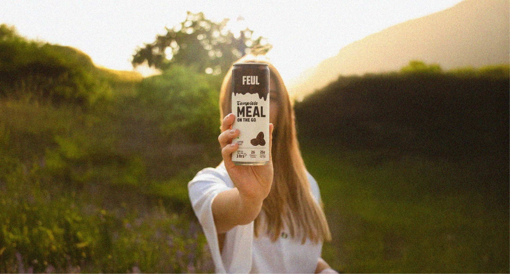
Designing India’s first on-the-go meal brand for a new generation that values speed, balance, and science-backed nutrition.®
About the Client
Feul is an on-the-go meal brand built for India’s new generation — busy professionals, students, and active individuals who want food that fits their fast-paced lives.
Inspired by global success stories in France and the US, Feul set out to redefine convenience by offering science-backed, balanced, and satisfying meals — food that’s as practical as it is nourishing.

The Problem
“Feul had to feel like the future of food — not just another health brand.”
The challenge was twofold:
Category Education: On-the-go meals are an established idea globally, but still new to the Indian market.
Brand Differentiation: Feul needed to stand out in an overcrowded health and nutrition landscape dominated by protein bars, powders, and snack startups — brands that often feel too niche or too generic.
We needed to design a brand language and investor narrative that conveyed trust, convenience, and modernity while building category credibility.
Problem Statement
How do you build a nutrition brand that feels aspirational, not clinical — one that fits into people’s real, messy, fast lives?
Feul needed to look cool enough for a startup founder, reliable enough for an investor, and approachable enough for a college student.
The brand had to speak to India’s changing food culture — where wellness meets convenience and credibility drives trust.
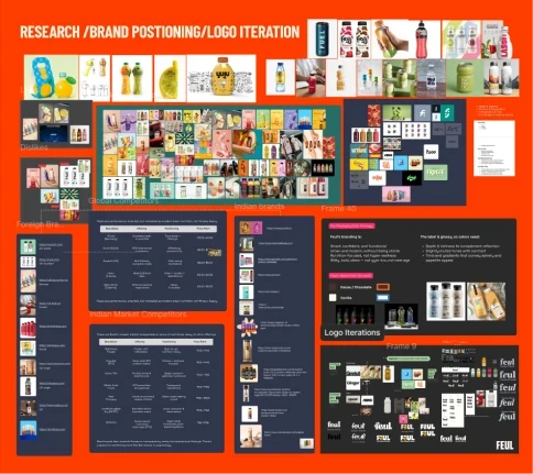
The Process
We started by mapping the urban nutrition landscape, analyzing both Indian competitors and global reference brands like Huel, YFood, and Soylent.Our design process unfolded in four strategic phases:
Our design process unfolded in four strategic phases:
Research & Insight
Studied audience behavior and purchase triggers
Identified gaps between “fast food” convenience and “healthy” credibility
Brand Strategy & Positioning
Defined Feul’s north star:
“To make balanced, science-backed nutrition easy, enjoyable, and accessible.”
We positioned Feul as the bridge between energy and nourishment.
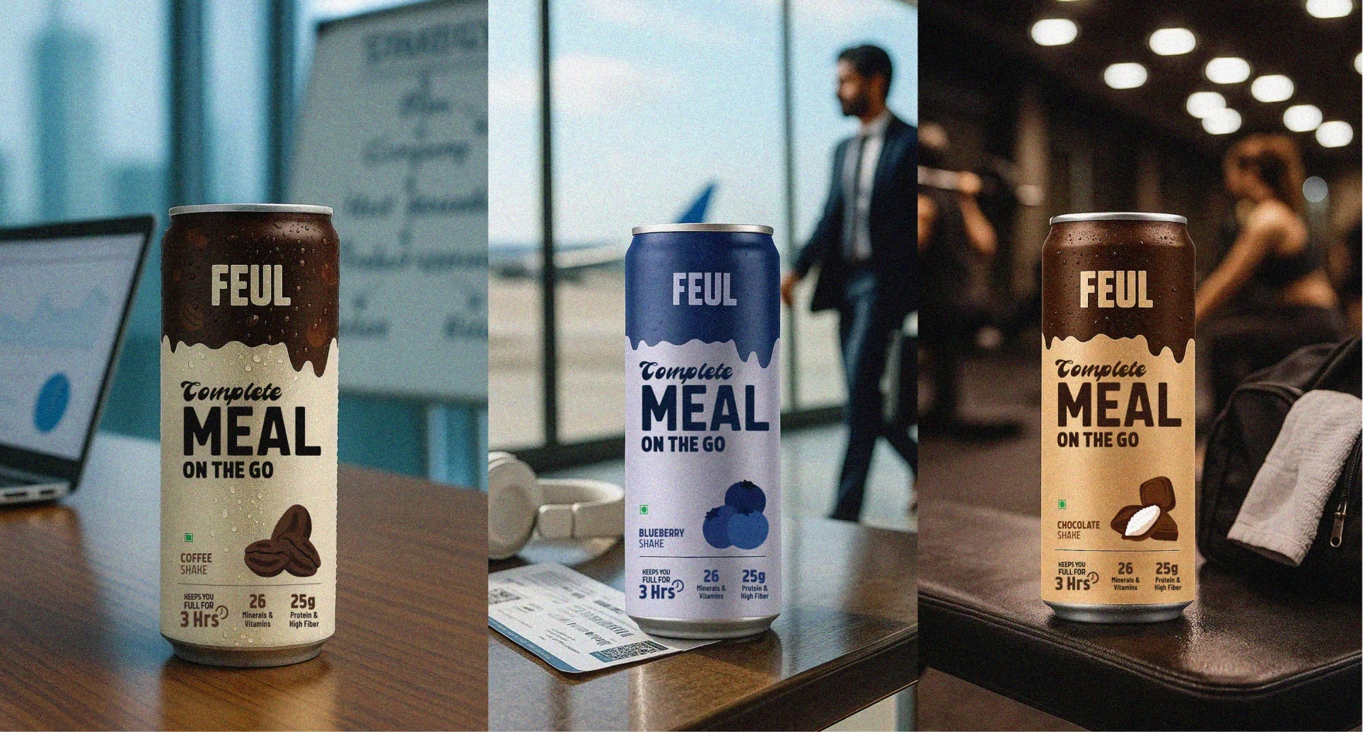
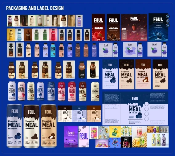
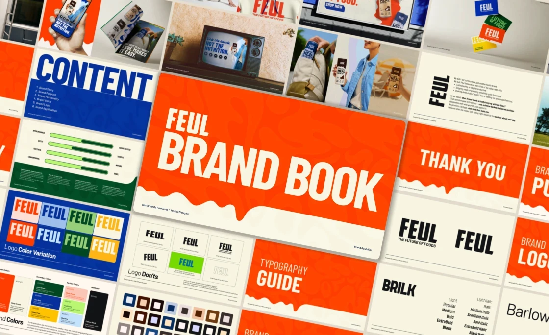
Visual Identity System
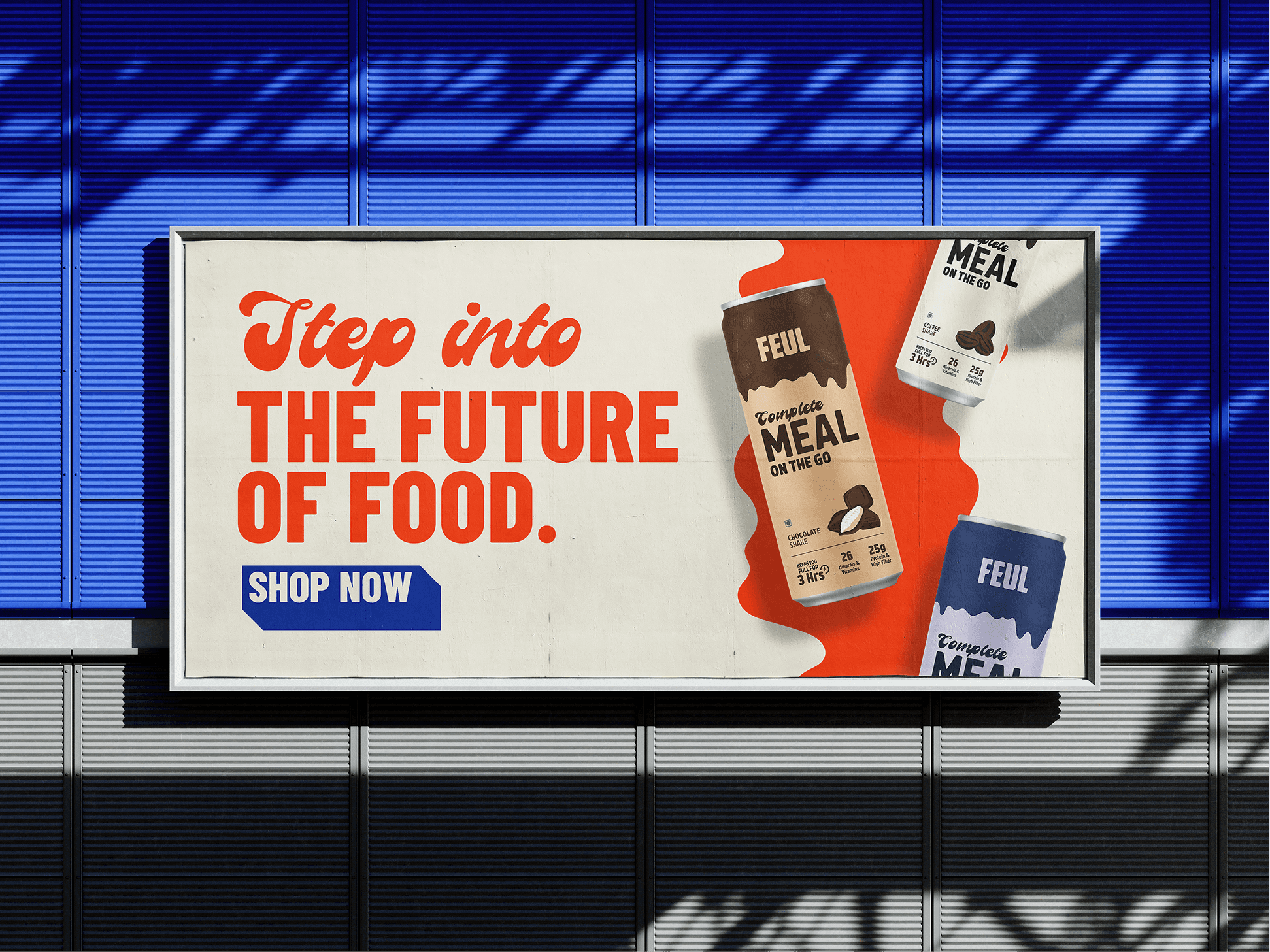
Developed a bold, minimal, and kinetic brand world — inspired by speed, rhythm, and science.
Modular packaging grids
Striking contrast palette (black, beige, and kinetic orange)
Typography with tech-inspired sharpness balanced by human warmth
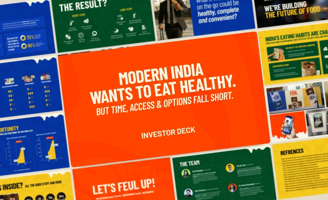
Investor Deck Design
Structured the story around problem clarity, market opportunity, and emotional resonance.
Clean infographics, data-backed slides, and strong brand storytelling helped articulate the scale of the opportunity.
The Solution
Feul’s new identity embodies energy in balance. It’s modern but relatable, scientific but not cold. A brand designed to move at the pace of its audience.
Design Highlights
Logo: Clean wordmark suggesting motion and continuity
Color Palette: Neutral tones offset by bright orange — a nod to fuel and vitality
Typography: Strong sans-serif with modular rhythm
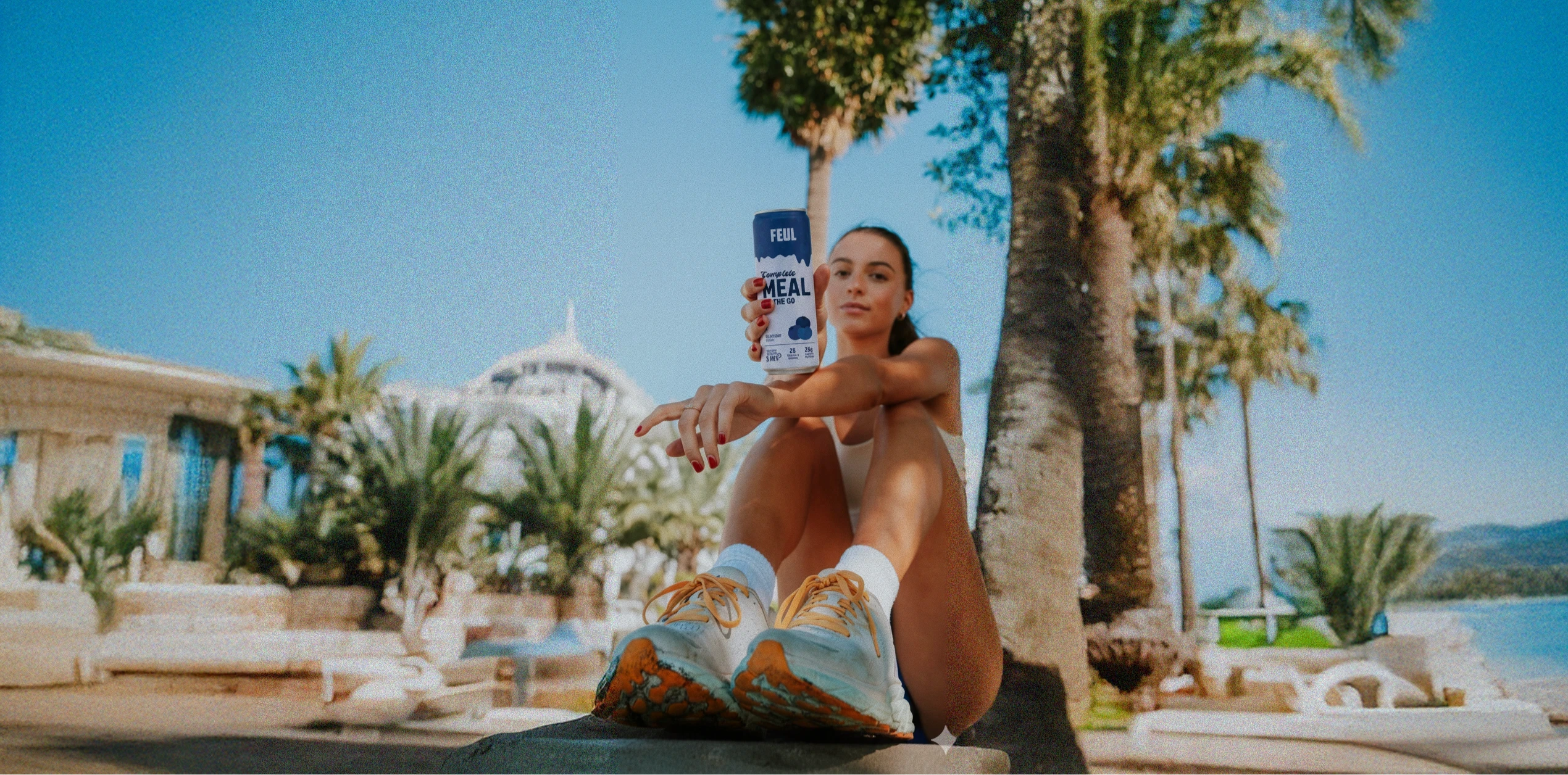
Imagery: Everyday people on the move — working, studying, training, living
Tone of Voice
Assertive yet empathetic.
Optimistic, real, and forward-looking.
“For India’s busiest people — real food, real fast.”
Reflection
Feul is more than a brand about nutrition — it’s about energy, balance, and culture.
For us, it was an exercise in designing for modern India’s appetite — fast, smart, and driven.
A brand that doesn’t slow people down — it moves with them.
Brand Outcomes
A distinct visual identity that breaks away from the clutter of overdesigned health-food startups
A brand language that feels intelligent, trustworthy, and everyday
Positioned Feul as India’s first scalable on-the-go meal brand ready to lead the category
Business Impact
Investor deck helped initiate early fundraising conversations
Positive perception shift among target users during test campaigns
Consistent engagement across digital channels, especially LinkedIn and Instagram
More Works
©2024


Project Lead
Aditya Kumar Sah
Team Member
Ishita Tae | Sushant Ajnikar | Aparajita Khandelwal
Know More
Designing India’s first on-the-go meal brand for a new generation that values speed, balance, and science-backed nutrition.®
About the Client
Feul is an on-the-go meal brand built for India’s new generation — busy professionals, students, and active individuals who want food that fits their fast-paced lives.
Inspired by global success stories in France and the US, Feul set out to redefine convenience by offering science-backed, balanced, and satisfying meals — food that’s as practical as it is nourishing.
The Problem
“Feul had to feel like the future of food — not just another health brand.”
The challenge was twofold:
Category Education: On-the-go meals are an established idea globally, but still new to the Indian market.
Brand Differentiation: Feul needed to stand out in an overcrowded health and nutrition landscape dominated by protein bars, powders, and snack startups — brands that often feel too niche or too generic.
We needed to design a brand language and investor narrative that conveyed trust, convenience, and modernity while building category credibility.
Problem Statement
How do you build a nutrition brand that feels aspirational, not clinical — one that fits into people’s real, messy, fast lives?
Feul needed to look cool enough for a startup founder, reliable enough for an investor, and approachable enough for a college student.
The brand had to speak to India’s changing food culture — where wellness meets convenience and credibility drives trust.
The Process
We started by mapping the urban nutrition landscape, analyzing both Indian competitors and global reference brands like Huel, YFood, and Soylent.Our design process unfolded in four strategic phases:
Our design process unfolded in four strategic phases:
Research & Insight
Studied audience behavior and purchase triggers
Identified gaps between “fast food” convenience and “healthy” credibility
Brand Strategy & Positioning
Defined Feul’s north star:
“To make balanced, science-backed nutrition easy, enjoyable, and accessible.”
We positioned Feul as the bridge between energy and nourishment.
Visual Identity System
Developed a bold, minimal, and kinetic brand world — inspired by speed, rhythm, and science.
Modular packaging grids
Striking contrast palette (black, beige, and kinetic orange)
Typography with tech-inspired sharpness balanced by human warmth
Investor Deck Design
Structured the story around problem clarity, market opportunity, and emotional resonance.
Clean infographics, data-backed slides, and strong brand storytelling helped articulate the scale of the opportunity.
The Solution
Feul’s new identity embodies energy in balance. It’s modern but relatable, scientific but not cold. A brand designed to move at the pace of its audience.
Design Highlights
Logo: Clean wordmark suggesting motion and continuity
Color Palette: Neutral tones offset by bright orange — a nod to fuel and vitality
Typography: Strong sans-serif with modular rhythm
Imagery: Everyday people on the move — working, studying, training, living
Tone of Voice
Assertive yet empathetic.
Optimistic, real, and forward-looking.
“For India’s busiest people — real food, real fast.”
Reflection
Feul is more than a brand about nutrition — it’s about energy, balance, and culture.
For us, it was an exercise in designing for modern India’s appetite — fast, smart, and driven.
A brand that doesn’t slow people down — it moves with them.
Brand Outcomes
A distinct visual identity that breaks away from the clutter of overdesigned health-food startups
A brand language that feels intelligent, trustworthy, and everyday
Positioned Feul as India’s first scalable on-the-go meal brand ready to lead the category
Business Impact
Investor deck helped initiate early fundraising conversations
Positive perception shift among target users during test campaigns
Consistent engagement across digital channels, especially LinkedIn and Instagram
More Works
©2024