
2024
Homeofarm
Homeofarm – Where Nature Meets Science
Branding
Website
Investor Deck
Project Lead
Aditya Kumar Sah
Team Member
Priyanka Satyarthi | Sushant Ajnikar
Know More
Revamping the identity, packaging, and digital presence of a homeopathy-inspired personal care brand, designed to bring holistic wellness into everyday routines.
About the Client
Founded by Dr. Jaswinder Kaur and Bhupinder Jeet Singh in Goa, Homeofarm blends the precision of homeopathy with the purity of nature’s finest ingredients to create holistic personal care products.
Driven by Dr. Jaswinder’s vision to take homeopathy beyond medicine, the brand aims to redefine perceptions and showcase its potential in modern self-care.
Homeofarm’s mission is simple yet powerful — to offer safe, natural, and effective products that promote well-being through the harmony of science and nature.

The Problem
Homeofarm’s expanding range — from baby care to hair and skin care — held tremendous promise, but its brand identity hadn’t evolved to match its vision.
The packaging across products felt dated, inconsistent, and disconnected from the brand’s core philosophy of purity, trust, and innovation. The existing design didn’t communicate the values of science and nature working in harmony, nor did the digital experience evoke modernity or care.
The challenge was to transform Homeofarm’s fragmented presence into a unified brand system that feels modern yet rooted, scientific yet warm, and trustworthy at every touchpoint.
In short, we needed to answer one key question:
How can a legacy rooted in homeopathy transform into a modern personal care brand without losing its soul?

The Audience
Homeofarm’s audience values natural, safe, and effective personal care solutions.
They seek sustainable, holistic alternatives for hair and skin — products that align with a lifestyle of mindful living and wellness.
This customer group:
Believes in authenticity and transparency
Prefers science-backed natural care
Resonates with brands that balance purity with innovation


The Process
Our approach combined strategic design and storytelling, creating a brand experience that’s holistic inside and out.
Discovery & Audit
Comprehensive brand and packaging audit
Review of website heuristics and user flow
Vision alignment with founders
Brand Direction
Defined core positioning: “Science in Harmony with Nature”
Developed moodboards inspired by earth tones, botanical textures, and modern apothecary design
Design & Execution
Logo refinement for clarity and balance
Introduced a soft, nature-inspired palette with shades of sage, ivory, and copper
Designed cohesive packaging across product categories
Directed lifestyle photography highlighting purity and craft
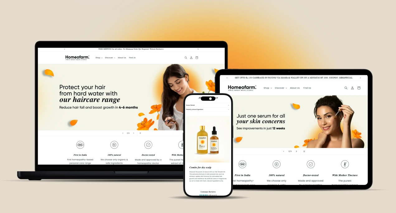
Revamped the website to reflect warmth, trust, and sophistication
Created marketing campaigns for social media and e-commerce (Amazon)
The Solution
The new Homeofarm identity unites science and serenity — a balance of credibility and calm.
Design Highlights
Unified Packaging System: Modular grid-based labels with natural illustrations and clear hierarchies
Color Palette: Pastel greens, soft neutrals, and copper accents representing purity and vitality
Typography: Contemporary serif paired with humanist sans for balance between tradition and modernity
Tone of Voice: Calm, confident, and caring

The Impact
Designing measurable change across brand perception and business growth.
Brand Outcomes
Created a cohesive design system across product ranges
Modernized brand perception — now aligned with the premium natural care segment
Elevated trust and authenticity through packaging and messaging consistency
Business Outcomes
Strengthened digital credibility with a redesigned, SEO-friendly website
Enhanced engagement through targeted campaigns on Amazon and social media
Established a scalable visual foundation for future retail expansion


More Works
©2024


2024
Homeofarm
Homeofarm – Where Nature Meets Science
Branding
Website
Investor Deck
Project Lead
Aditya Kumar Sah
Team Member
Priyanka Satyarthi | Sushant Ajnikar
Know More
Revamping the identity, packaging, and digital presence of a homeopathy-inspired personal care brand, designed to bring holistic wellness into everyday routines.
About the Client
Founded by Dr. Jaswinder Kaur and Bhupinder Jeet Singh in Goa, Homeofarm blends the precision of homeopathy with the purity of nature’s finest ingredients to create holistic personal care products.
Driven by Dr. Jaswinder’s vision to take homeopathy beyond medicine, the brand aims to redefine perceptions and showcase its potential in modern self-care.
Homeofarm’s mission is simple yet powerful — to offer safe, natural, and effective products that promote well-being through the harmony of science and nature.
The Problem
Homeofarm’s expanding range — from baby care to hair and skin care — held tremendous promise, but its brand identity hadn’t evolved to match its vision.
The packaging across products felt dated, inconsistent, and disconnected from the brand’s core philosophy of purity, trust, and innovation. The existing design didn’t communicate the values of science and nature working in harmony, nor did the digital experience evoke modernity or care.
The challenge was to transform Homeofarm’s fragmented presence into a unified brand system that feels modern yet rooted, scientific yet warm, and trustworthy at every touchpoint.
In short, we needed to answer one key question:
How can a legacy rooted in homeopathy transform into a modern personal care brand without losing its soul?
The Audience
Homeofarm’s audience values natural, safe, and effective personal care solutions.
They seek sustainable, holistic alternatives for hair and skin — products that align with a lifestyle of mindful living and wellness.
This customer group:
Believes in authenticity and transparency
Prefers science-backed natural care
Resonates with brands that balance purity with innovation
The Process
Our approach combined strategic design and storytelling, creating a brand experience that’s holistic inside and out.
Discovery & Audit
Comprehensive brand and packaging audit
Review of website heuristics and user flow
Vision alignment with founders
Brand Direction
Defined core positioning: “Science in Harmony with Nature”
Developed moodboards inspired by earth tones, botanical textures, and modern apothecary design
Design & Execution
Logo refinement for clarity and balance
Introduced a soft, nature-inspired palette with shades of sage, ivory, and copper
Designed cohesive packaging across product categories
Directed lifestyle photography highlighting purity and craft
Revamped the website to reflect warmth, trust, and sophistication
Created marketing campaigns for social media and e-commerce (Amazon)
The Solution
The new Homeofarm identity unites science and serenity — a balance of credibility and calm.
Design Highlights
Unified Packaging System: Modular grid-based labels with natural illustrations and clear hierarchies
Color Palette: Pastel greens, soft neutrals, and copper accents representing purity and vitality
Typography: Contemporary serif paired with humanist sans for balance between tradition and modernity
Tone of Voice: Calm, confident, and caring
The Impact
Designing measurable change across brand perception and business growth.
Brand Outcomes
Created a cohesive design system across product ranges
Modernized brand perception — now aligned with the premium natural care segment
Elevated trust and authenticity through packaging and messaging consistency
Business Outcomes
Strengthened digital credibility with a redesigned, SEO-friendly website
Enhanced engagement through targeted campaigns on Amazon and social media
Established a scalable visual foundation for future retail expansion
More Works
©2024
2024
Homeofarm
Homeofarm – Where Nature Meets Science
Branding
Website
Investor Deck
Project Lead
Aditya Kumar Sah
Team Member
Priyanka Satyarthi | Sushant Ajnikar
Know More
Revamping the identity, packaging, and digital presence of a homeopathy-inspired personal care brand, designed to bring holistic wellness into everyday routines.
About the Client
Founded by Dr. Jaswinder Kaur and Bhupinder Jeet Singh in Goa, Homeofarm blends the precision of homeopathy with the purity of nature’s finest ingredients to create holistic personal care products.
Driven by Dr. Jaswinder’s vision to take homeopathy beyond medicine, the brand aims to redefine perceptions and showcase its potential in modern self-care.
Homeofarm’s mission is simple yet powerful — to offer safe, natural, and effective products that promote well-being through the harmony of science and nature.
The Problem
Homeofarm’s expanding range — from baby care to hair and skin care — held tremendous promise, but its brand identity hadn’t evolved to match its vision.
The packaging across products felt dated, inconsistent, and disconnected from the brand’s core philosophy of purity, trust, and innovation. The existing design didn’t communicate the values of science and nature working in harmony, nor did the digital experience evoke modernity or care.
The challenge was to transform Homeofarm’s fragmented presence into a unified brand system that feels modern yet rooted, scientific yet warm, and trustworthy at every touchpoint.
In short, we needed to answer one key question:
How can a legacy rooted in homeopathy transform into a modern personal care brand without losing its soul?
The Audience
Homeofarm’s audience values natural, safe, and effective personal care solutions.
They seek sustainable, holistic alternatives for hair and skin — products that align with a lifestyle of mindful living and wellness.
This customer group:
Believes in authenticity and transparency
Prefers science-backed natural care
Resonates with brands that balance purity with innovation
The Process
Our approach combined strategic design and storytelling, creating a brand experience that’s holistic inside and out.
Discovery & Audit
Comprehensive brand and packaging audit
Review of website heuristics and user flow
Vision alignment with founders
Brand Direction
Defined core positioning: “Science in Harmony with Nature”
Developed moodboards inspired by earth tones, botanical textures, and modern apothecary design
Design & Execution
Logo refinement for clarity and balance
Introduced a soft, nature-inspired palette with shades of sage, ivory, and copper
Designed cohesive packaging across product categories
Directed lifestyle photography highlighting purity and craft
Revamped the website to reflect warmth, trust, and sophistication
Created marketing campaigns for social media and e-commerce (Amazon)
The Solution
The new Homeofarm identity unites science and serenity — a balance of credibility and calm.
Design Highlights
Unified Packaging System: Modular grid-based labels with natural illustrations and clear hierarchies
Color Palette: Pastel greens, soft neutrals, and copper accents representing purity and vitality
Typography: Contemporary serif paired with humanist sans for balance between tradition and modernity
Tone of Voice: Calm, confident, and caring
The Impact
Designing measurable change across brand perception and business growth.
Brand Outcomes
Created a cohesive design system across product ranges
Modernized brand perception — now aligned with the premium natural care segment
Elevated trust and authenticity through packaging and messaging consistency
Business Outcomes
Strengthened digital credibility with a redesigned, SEO-friendly website
Enhanced engagement through targeted campaigns on Amazon and social media
Established a scalable visual foundation for future retail expansion
More Works
©2024